インポート
# import manipulation
import numpy as np
import pandas as pd
import seaborn as sns
import matplotlib.pyplot as plt
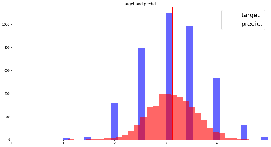
ヒストグラム
fig = plt.figure()

columns_name0 = 'target'
columns_name1 = 'predict'

plt.hist(df[columns_name0],
         bins=30,    # ビンの数
         alpha=0.6,  # 透過度
         color='b')  # 色(青)
plt.hist(df[columns_name0],
         bins=30,
         alpha=0.6,
         color='r')
plt.rcParams['figure.figsize']=(15, 8)
plt.title(f"{columns_name0} and {columns_name1}")

# 平均
plt.axvline(df[columns_name0].mean(), color='b', linewidth=1)
plt.axvline(df[columns_name1].mean(), color='r', linewidth=1)
# 中央値
plt.axvline(df[columns_name0].median(), color='b', linewidth=1, linestyle='dashed')
plt.axvline(df[columns_name1].median(), color='r', linewidth=1, linestyle='dashed')

plt.legend([columns_name0, columns_name1], fontsize=20)
plt.xlim(0, 5)

plt.show()
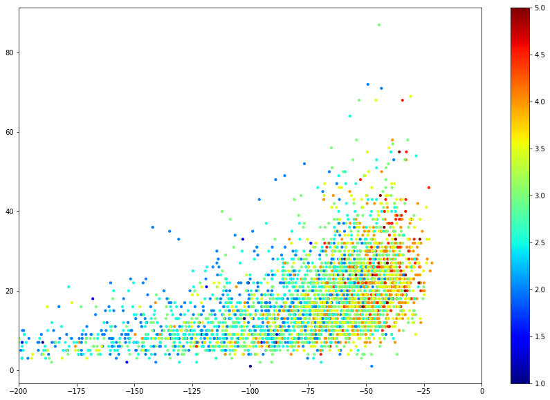
散布図
色付き散布図
plt.scatter(df.target, df.predict, c=df['strength'], cmap='jet', s=10)
plt.xlim(-200, 0)
plt.rcParams["figure.figsize"]=(15, 10)
plt.colorbar()
ヒートマップ
label_columns = ['feature0', 'feature1', 'feature2', 'feature3']

corr = df[label_columns].corr()
sns.set(rc = {"figure.figsize": (15, 5)})
sns.heatmap(corr, xticklabels = corr.columns, yticklabels = corr.columns, annot = True, cmap = "coolwarm", fmt = ".2f")
plt.show()